Video Moodboard for a Client, Method and Free Template
How to build a video moodboard that gets your client and your crew on the same page, choosing images, organizing them and presenting them. Free template included.
 Franck Meyer ·
·
8 min read
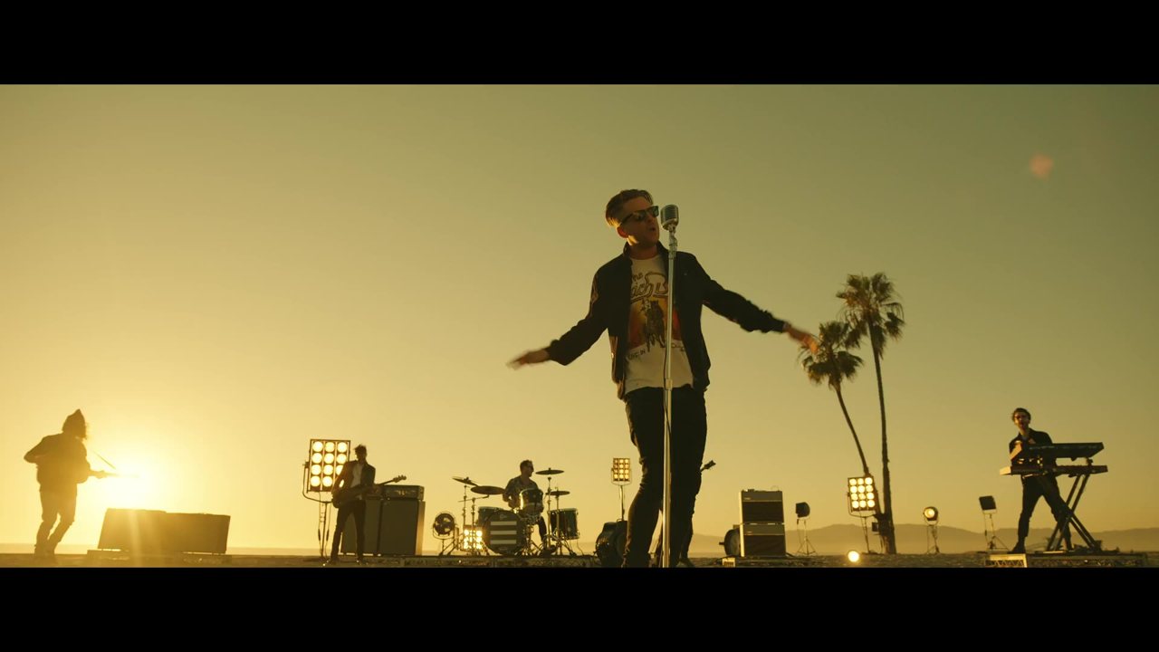
A video moodboard is the board that keeps a client from approving one thing and discovering another at the first cut. You gather stills from films, commercials, lighting references, sets and colors to show what the video will look like before the shoot. It matters most when the look is hard to describe in words. With a client, that's almost always the case.
Words never describe an image well enough
Picture a pretty ordinary note. The director wants a scene that feels "warm but tense." The DP thinks golden light. The production designer sees wood and amber glass. The costume designer pulls earth-toned linen. Three departments, three different films, and nobody is really wrong.
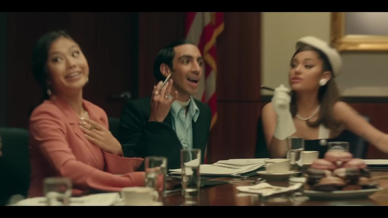
Wikipedia defines the moodboard as a "type of visual presentation" that conveys the feel of an idea quickly. The page leans on an academic paper from the Journal of Business Research whose title says it all. It's about balancing coordination and creative freedom. The board aligns the team without dictating every shot.
With a client, the stakes go up a notch. They don't speak your technical language. "Dynamic," "premium," "authentic": these words mean nothing until they have an image attached. The moodboard becomes the shared reference between the client, the director, the DP and everyone else involved.
And it doesn't have to be pretty. Or complete. It just has to get everyone who will sign off on the video imagining roughly the same thing. A rough board that gets everyone aligned beats a gorgeous board that everyone reads differently.
A moodboard is not a treatment or a lookbook
People often mix up these documents. That creates misunderstandings with the client, so let's separate them clearly.
The director's treatment is text and images explaining how they would shoot an existing brief (an agency's, a song, a script). Its goal is to win the job. In advertising, it often runs between 5 and 12 pages. Hype Williams' treatment for Nas and Lauryn Hill's "If I Ruled the World" opens by comparing the look to "an abstract painting." Tighe Kellner's treatment for "Blue Eyes" by The Rosebuds drew on a frame from Boogie Nights. And some treatments have no images at all. A creative quoted by Pond5 says they constantly receive music video treatments that are "just text."
The lookbook gets into the details. It's for the crew on shoot day. Style frames show the target final image. The moodboard stays at the level of feel and doesn't show exact shots. One software company suggests a simple split. The client approves the moodboard and the style frames, while the lookbook is approved by the director and the department heads. That's one opinion, but it holds up.
The pitch deck, finally, is aimed at financiers. It sells the project's viability, not how it will be made.
The right time for the moodboard is at kickoff, early in prep. Before the storyboard, before the tech scouts. If your project relies mostly on movement and editing (a fashion film, for example), think about a mood edit or an animatic. A short cut of references will show rhythm far better than a still board.
Cast a wide net, then cut ruthlessly
Collecting happens in two stages. First you grab everything without censoring yourself. Then you sort. If you sort while you search, you miss the unexpected images, the ones that unlock a direction.
What you're looking for, roughly.
- Stills from films, series and commercials, for camera style and pacing.
- Lighting references.
- Sets and locations.
- Faces, silhouettes, costumes.
- A palette, ideally pulled from the brand guidelines.
- Typography and on-screen text.
- Paintings, photographs, concept art if the project calls for it.
For video references, the fastest way is to start from the clip itself. Paste the link to the reference commercial or film into Scenorama and choose extraction by shot change. You get one frame per shot and you keep the ones that speak to you.
An image doesn't have to show exactly what you're going to shoot. It's a reference, not a model to copy. You can take the lighting from one film, the palette from a fashion photo and the framing from a car commercial. The client will understand the combination if you caption it well.
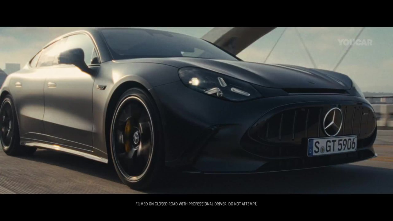
Think about the departments people forget, too. If your video has visual effects, include references for the VFX team. It saves them from hunting for their own. One author tells of supplying Google Maps screenshots to illustrate a simple blinking marker.
Then comes the cull. What matters is consistency, not quantity. Throw out images that contradict each other. Limit the palette to five colors, which is enough for the vast majority of video projects. And don't settle for colors or logos alone. A color on its own tells no story.
A board that reads like a work plan
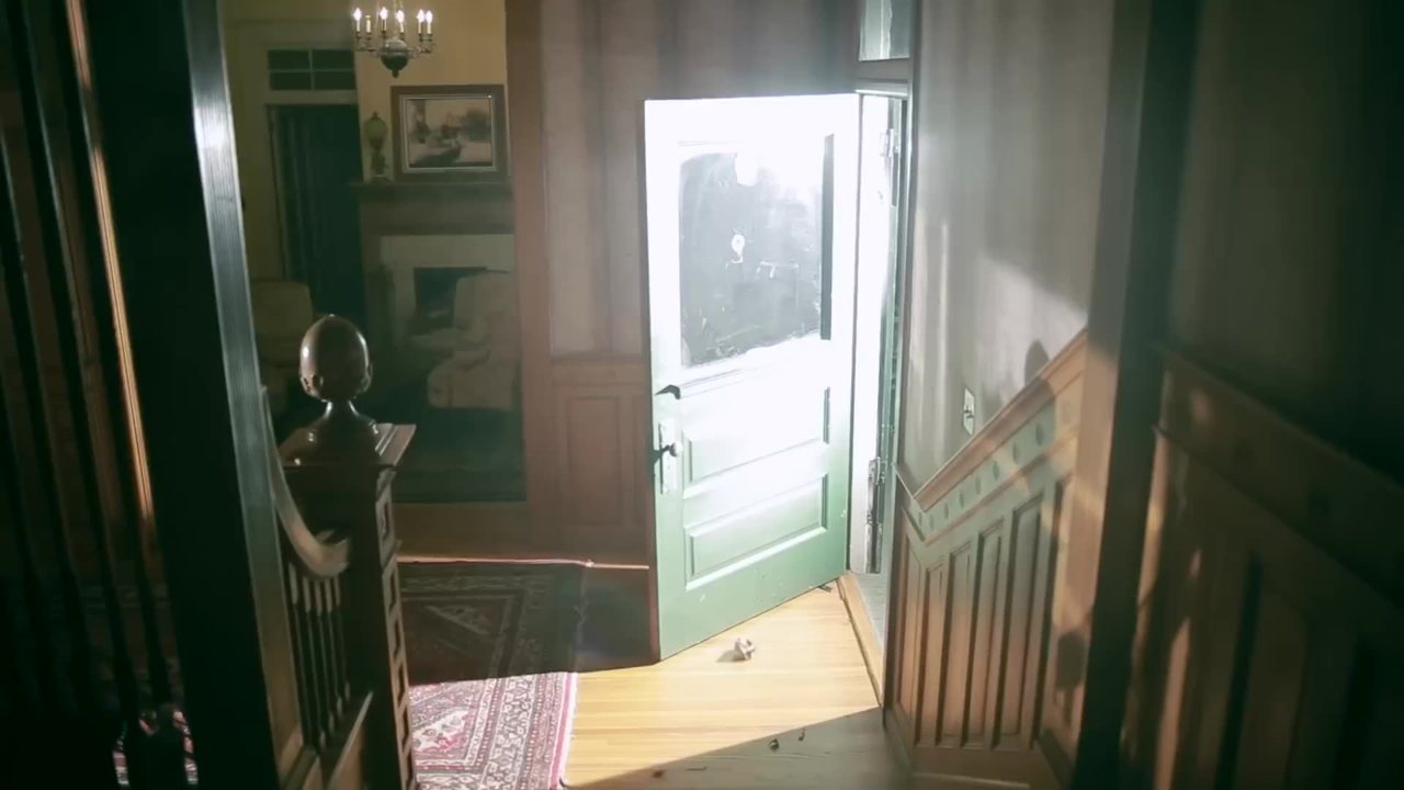
Once you've culled, group the images by topic. Image, locations, characters, lighting, set, composition. A client reads a structured board more easily, and each department head instantly finds their section.
Caption each image with the decision it illustrates and the department concerned. For example, "Soft backlight late in the day, skin slightly overexposed. Lighting." Without a caption, your client will look at the singer in the center when you picked the image for the backlight. With a caption, they look at what you want them to look at.
For a video project, pick a tool that accepts GIFs and video clips. A still board shows the pace of an edit or a camera move poorly. Three seconds of a tracking shot are worth ten screenshots.
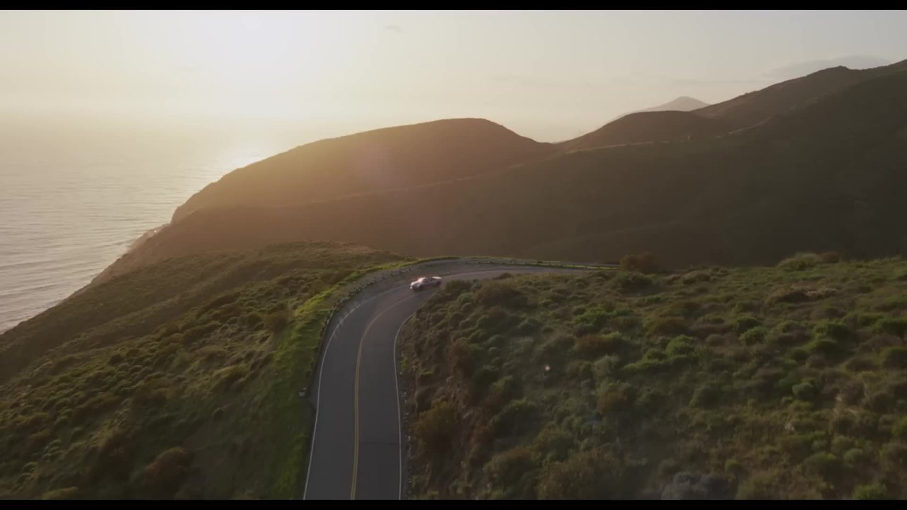
Watch out for the decorative board trap. The moodboard is a production tool. If an image is there just because it's pretty, it doesn't belong. And if the vision stays in your head, the departments can't build it.
The free template to copy
This template is inspired by the "Director's Mood Board" sheet from Into Film, a British educational charity. I adapted it for working with a client. Copy the sections into your layout software or board tool, one section per block.
- Synopsis. Three sentences max. If you can't manage that, the direction isn't clear yet.
- Time and place. Where and when the video takes place, even for a product spot.
- Overall mood. Three adjectives and two or three images that embody them.
- Subject or protagonist. Face, attitude, costume.
- How to shoot it. Angles, framing, camera moves, editing pace.
- Lighting. Two to four captioned references.
- Colors. Five at most, pulled from the brand guidelines if they exist.
- Sets and props.
- On-screen text and typography.
- What to avoid. One or two crossed-out images, to shut down the wrong leads.
Every image carries its caption. The decision, then the department. Nothing else.
Never let the client discover the board alone
The classic mistake is emailing the PDF and waiting. The client skims it in silence, between two meetings, and fixates on one detail. Walk them through it.
On a video call, share your screen and scroll slowly through the board from top to bottom. The client follows the visual flow in the order you planned. Start with the feel and the why, and the details come after. A 15 to 30 minute meeting is enough.
Present one direction, not three. Offering three directions shows you haven't made a call and hands the decision back to the client. Also prepare a justification for each image. A single reference you can't defend can bring down the whole direction.
And accept that the first version won't be the right one. A moodboard is never final on the first pass. The client's feedback is part of the job.
With your crew, the same board does something else. It kicks off the technical discussion. "Is this lighting reference compatible with our budget?" Better to ask that in prep than on set.
For your next project, try this before you even look for the first image. Write down three mood words and ask the client to write three of their own, without talking to each other. Compare the two lists. The gap between them will tell you exactly which images to look for first.
Frequently asked questions
How many images should a video moodboard have?
There's no magic number, consistency is what counts. Too many images end up showing too many directions at once. Keep only the ones you can justify in front of the client.
What's the difference between a moodboard and a storyboard?
The moodboard conveys the overall feel, the lighting, the colors, the world. The storyboard breaks the video down shot by shot. The moodboard comes first, at the start of prep.
Should you offer the client several directions?
Present just one, and defend it well. Three directions show you haven't made a call and hand the decision back to the client. You can adjust afterward with their feedback.
Can you make a video moodboard with animated clips?
Yes, and it's even recommended for a video project. A still board shows editing rhythm and camera moves poorly. For projects driven heavily by movement, a mood edit or an animatic works even better.
Try it on your own video
Paste a YouTube, TikTok, Instagram or Vimeo link. Scenorama extracts the frames, you annotate them and export your moodboard as a PDF.
Franck MeyerVideographer, Founder of Scenorama