The Rule of Thirds in Video, When to Follow It and When to Break It
What the rule of thirds really says, where it comes from, and how to break it with a method, with the Mr. Robot example and the mistakes to avoid.
 Franck Meyer ·
·
15 min read
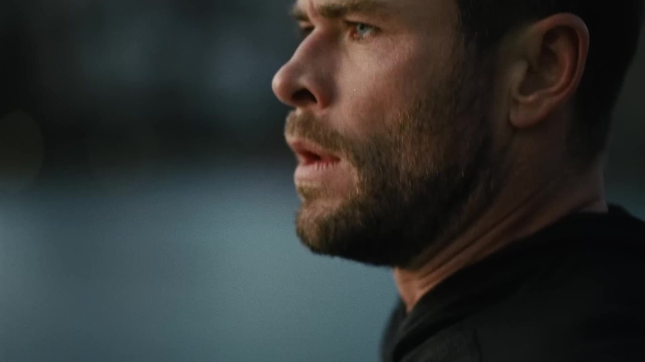
The rule of thirds is a grid. Two horizontal lines, two vertical lines, evenly spaced across your frame. The image ends up split into nine equal parts, and the idea is to put what matters on those lines or at their intersections instead of dead center. It's the first composition rule you learn, often the only one you remember, and also the one you apply the most mechanically.
The problem isn't the grid. It's the way we turn it into a law. You've probably seen shots that were perfectly "on thirds" and said nothing, and shots that ignored it completely and stuck with you for days. The difference rarely comes down to where the subject sits. It comes down to why it's there.
Nine boxes, four points and a bit of vocabulary
In French, the lines placed at the thirds are called "lignes de force," or power lines. Their four intersections are the power points, or "points forts" depending on the source. The Médialab at the Université de Limoges sums up the goal in a simple phrase, "energize your framing, make it more alive." That's honest. The rule doesn't promise a beautiful image. It promises a less static one.
A quick side note. Some teaching pages talk about "six parts." Two horizontal lines and two vertical lines give you nine boxes, not six. It sounds trivial, but when the foundation is sloppy, the rest of the reasoning usually is too.
Three terms come up as soon as you read a DP interview or work with an English-speaking crew. Lead room (also called nose room or looking room) is the space left in front of the face, on the side where the character is looking. Headroom is the space above the head. Short-siding is the opposite of lead room. The face sits on the side of the frame closest to the person being spoken to, and the empty space ends up behind the head. Keep these three words in mind.
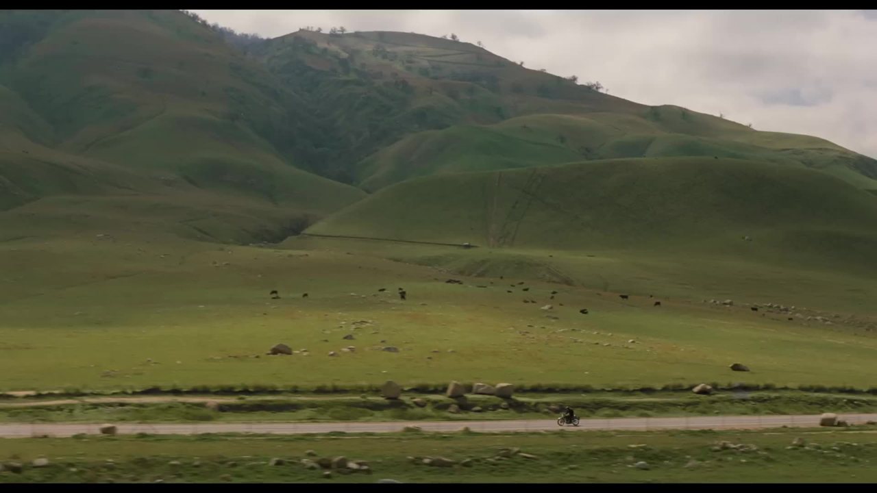
The basic uses are well known. For a landscape, the horizon goes on the top line if the foreground is more interesting than the sky, and on the bottom line if the sky is what tells the story. A wheat field under a flat gray sky, horizon high. A sunset setting the clouds ablaze over a featureless plain, horizon low. For a portrait, you put the eye closest to the camera on an intersection point. In video, Apprendre le cinéma recommends moving the subject off-center to break symmetry, putting the character on a vertical line and letting their gaze land on a power point.
A rule that's younger than you think
The rule of thirds is often presented as a legacy of the great painters, or even as a simplified version of the golden ratio. Both ideas are wrong, or at the very least heavily exaggerated.
The phrase "rule of thirds" first appears in 1797, written by John Thomas Smith in a book called Remarks on Rural Scenery. Smith builds on a text by Joshua Reynolds from 1783, which talks about the balance between shadow and light in a painting. And in Smith, the idea has nothing to do with a grid. He explains that a ratio of one third to two thirds is more pleasing to the eye than other divisions. No subject sitting on an intersection, no power points.
The modern version, the one with the grid and the four points, spread much later. According to a 2024 PetaPixel article, it was probably Carleton Wallace, a mainstream author, who popularized it. In 1963, he was also the first major author to confuse it with the golden ratio. Again according to PetaPixel, presenting these methods as fundamental or ancient doesn't hold up.
That changes how you use it. As long as you believe a rule comes from the old masters, you don't dare question it. Once you know it's a textbook trick, a pretty good one by the way, you treat it as one tool among others. Another PetaPixel article, from 2021, suggests calling it the "suggestion of thirds," a suggestion rather than a rule. Better wording.
What the grid actually does to your shot
Putting a subject in the center creates balance. The image is stable, the eye lands there and stops. Moving it to a third creates a slight imbalance. An empty zone remains on one side, and that empty zone calls for something. A gaze heading into it, a movement about to cross it, an element of the set that answers it.
That's the real value of the rule. It doesn't place your subject, it creates space around it and forces you to decide what that space is for. Take an interview where the guest looks at a journalist sitting off-camera, just to the right of the lens. If you frame the guest on the left vertical line, their gaze crosses two thirds of the frame toward the invisible interviewer. The viewer feels the conversation. If you frame them on the right line, their nose almost grazes the edge, and they look like they're talking to a wall.
In a two-camera interview, the same logic applies to both angles. The main camera frames the guest on a third with their gaze heading toward the center. The second, tighter and offset, can put them on the same side to keep continuity, or on the other side if you want to mark a break in the edit. Decide that before you set foot on location, not while going through the footage.
This is exactly lead room. In a shot where someone looks, walks or rides, you leave space in front of them. A cyclist filmed in profile heading right is framed on the left third, so there's road ahead of them. The same cyclist stuck to the right edge feels like they're about to leave the frame, or like they're blocked. That's not wrong in itself. It just means something else.
Headroom follows the same logic on the vertical axis. In a medium close-up, the eyes generally sit on the top horizontal line. The head doesn't touch the edge, but it isn't crushed under a big gap of ceiling either. Too much headroom, and the character looks like they're sinking to the bottom of the image. Too little, and they look cramped. Remember that "too much headroom." Some people have made a style out of it.
Dialogue, the classic playground of the rule
Shot/reverse shot is where the rule of thirds is most firmly established. Two characters talk. The first is framed on the left third looking right. The second, in the reverse shot, is framed on the right third looking left. Each has their lead room, and the two gazes seem to cross through the edit.
This pattern is so common that you stop noticing it. It's part of the grammar the audience reads without thinking, like the 180-degree rule. And that's precisely why it becomes interesting to break. When a convention is invisible, the slightest deviation shows.
Mr. Robot, or breaking the rule for a reason
Mr. Robot, the series created by Sam Esmail, is the most telling example. Cinematographer Tod Campbell joined the show starting with episode 2, and the approach to dialogue is radical. Instead of giving each character space in front of their face, the show uses short-siding. The face is pushed to the side of the frame closest to the person being spoken to. The huge empty space ends up behind the head.
Campbell summed it up in one line to Slate, "Shortsighting is unnerving." That was the point. The show follows Elliot, a character cut off from others, and the frame had to make you feel his loneliness. When Elliot talks to someone with his face jammed against the edge and all that emptiness behind him, he doesn't really seem to be in a conversation. He seems alone in the room, even with company.
There's also a technical effect that's mentioned less often. Again according to Slate, this framing let Campbell bring a wider lens closer to the actors. A wide angle close to a face opens up the space around it, which reinforces the impression of a character lost in the set.
Headroom goes the same way. The show leaves a lot of space above the heads and often places Elliot in a corner of the frame to isolate him. One analysis site calls it lower quadrant framing. Characters are pushed down into the lower corners of the image, and it feels like something is weighing on them from above. That's an outside reading, to be taken as such, but it fits what you see on screen.

The most revealing part is what Campbell says about the shoot. With his executive producer's approval, he hid the dailies from the studio for the first six days. He was afraid of being fired because of these framings. That says a lot about the strength of the convention. Even on a show looking for a distinctive style, pushing faces to the "wrong side" felt like professional misconduct. He was proven right. Campbell received his first Emmy nomination in 2017 for this show.
Another detail that shows how coherent the project was. A Steadicam operator was on set at all times, but the Steadicam was only used once, in the finale. Having the tool at hand and choosing not to use it means knowing what you want.
Why a deviation only works inside a system
The most useful lesson from Mr. Robot sits in one detail reported by Slate. Short-siding was extended to all the characters, not just Elliot. Once that system was in place, every deviation became that much more striking.
Read that sentence again, because it applies to everything you shoot. An unusual framing has no meaning in isolation. If you drop a single short-sided shot in the middle of a conventionally framed dialogue, the viewer won't feel the character's loneliness. They'll think the operator made a mistake, or that the editor picked the wrong take. For a deviation to speak, you need a norm. Either classical cinema's norm, which the audience already knows, and you depart from it at a specific moment for a specific reason. Or your own norm, established early enough and long enough for the audience to learn it.
In practice, that means choosing your system before you shoot. For a short film about someone who feels like a stranger in their own family, you could frame all the family members classically, with lead room, and reserve short-siding for the main character. Or the reverse, everyone short-sided, and a single shot near the end where the main character gets space in front of them because they finally have someone to talk to. In both cases, that shot only works because all the others set the stage.
If you want to test it on a simple shot/reverse shot, put your scene partner to the right of the camera. Your character is therefore looking right. Frame them on the right third, face turned toward the nearest edge, and leave the rest of the frame to the set (a wall, a window, a shelf). The more neutral that background, the heavier the emptiness feels. Lower the frame slightly to add headroom. On the monitor, you feel the difference right away.
Watch your eyelines. Short-siding changes the position of the face in the frame, not the direction of the looks. Your first character still looks right, the second still looks left. If you flip the eyelines too, you break the 180-degree rule on top of the rule of thirds, and the viewer no longer knows who's talking to whom.
The center has its reasons too
The rule of thirds is there to energize. But you don't always want to energize. A centered shot says something else, stability, frontality, sometimes confrontation. A character framed dead center and looking into the lens leaves the viewer no way out.
Wes Anderson is often cited for his symmetrical compositions, and Stanley Kubrick for his central perspectives, with vanishing lines converging in the middle of the image. In both cases, the center isn't a shortcut. It's a choice held across the whole film, which brings us back to the system logic of Mr. Robot. A centered shot in the middle of an off-center film grabs attention. A fully centered film creates a world.
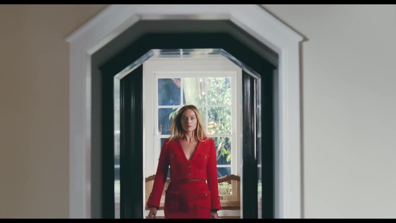
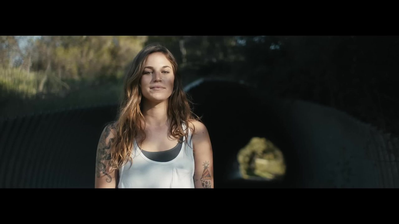
In your day-to-day work, the center also has very practical uses. A product shot, a tutorial where the person addresses the audience directly, a frontal group shot. Forcing the rule of thirds on a video where someone looks you in the eye to explain a recipe often gives a strange image, as if the person were talking to someone other than you.
The mistakes you see all the time
Some come from misunderstanding the rule, others from applying it too mechanically.
- Confusing the rule of thirds with the golden ratio. Some sites still claim the rule "derives from the golden ratio." That's a conflation from the 1960s, not an ancient principle. The two grids don't even land in the same place, the golden ratio ones are tighter toward the center.
- Getting the grid itself wrong. Nine boxes, four points, two lines in each direction. If a tutorial tells you about six zones, be wary of the rest.
- Making it an absolute rule. It's a suggestion. A centered shot isn't a mistake, and an off-center shot isn't automatically a good one.
- Forgetting lead room in a classic dialogue. If you have no reason to make your character uncomfortable, leave them space in front of their gaze. Otherwise the viewer feels an unease you didn't intend.
- Breaking the rule only occasionally. A single short-sided shot looks like a mistake. A coherent system turns the same shot into a choice.
- Leaving the empty third without a function. The free space has to do something (a gaze, a direction, a set element). Otherwise it's just emptiness.
Thirds shift when the format or the subject shifts
A more recent mistake comes from the multiplication of formats. You shoot in 16:9 and then reframe to 9:16 for social. Your character, carefully placed on the left vertical line, ends up cut off or jammed against the edge, because the grid of the vertical format has nothing to do with that of the horizontal one. If you know from the shoot that a vertical version will exist, frame wider and check where the grid will fall in both formats. Some monitors let you display several frame guides at once.
In vertical, think about the interface too. The account name, the caption and the buttons cover part of the bottom and right side of the image on most apps. The bottom third, where you'd have put the horizon of a landscape, is often partly hidden. Move your important elements up.
Another trap is movement. The rule of thirds is designed for a still image. In video, your subject moves, and so does the camera. A character crossing the frame from left to right necessarily passes through the center. What matters is the position at the start and end of the shot, and the space left in front of the movement along the way. A pan following a runner while keeping them on the left third gives them momentum. The same pan keeping them on the right third makes them chase something that's slipping away.
An exercise to stop framing at random
The best way to understand the rule of thirds is to look at what others do instead of reciting the diagram. Take a dialogue scene from a film or series you love, two or three minutes is enough. Extract one frame per shot. To go fast, paste the link into Scenorama and pick extraction by shot change, you get one image per shot without grabbing screenshots by hand.
Then open those images in Photoshop and run the Crop tool over each one, which shows a rule of thirds grid overlay. For each shot, note three things.
- Where the eyes sit relative to the top line.
- Which side the empty space is on, in front of the gaze or behind the head.
- Whether the framing changes when the scene turns (a reveal, a fight, a reconciliation).
You'll quickly spot the system of the scene. Often it's classical for most of the dialogue, then one framing departs from it when something breaks between the characters. Sometimes, as in Mr. Robot, the whole system runs against the grain, and the return to a normal framing becomes the event.
Then do the reverse exercise on your next shoot. Before turning the camera on, write down the framing system for your scene in one line. For example, "classic dialogue with lead room, except Léa's last shot, jammed against the right edge." Turn on the grid on your camera or phone, stick to that system, and depart from it only once. In the edit, show the scene to someone who knows nothing about your plan and ask them when they felt something change. If they point to your shot, you've understood the rule of thirds better than any diagram will ever explain it to you.
Frequently asked questions
Does the rule of thirds come from the golden ratio?
No. The phrase appears in 1797 with John Thomas Smith, with the idea that a ratio of one third to two thirds is pleasing to the eye. The confusion with the golden ratio dates from 1963, with mainstream author Carleton Wallace, according to PetaPixel.
Should you always follow the rule of thirds in video?
No, it's a suggestion more than a rule. It helps energize a frame, but a centered shot has its own reasons. What matters is keeping a coherent system and departing from it only for a specific narrative reason.
Where should you place the eyes in a close-up?
Generally on the top horizontal line, with the eye closest to the camera on a power point. Leave space in front of the gaze (lead room) if you want a classic dialogue that feels comfortable to the viewer.
What is short-siding?
It means placing the face on the side of the frame closest to the person being spoken to, with the empty space behind the head. The series Mr. Robot uses it for all its characters to create unease and make you feel Elliot's isolation.
Try it on your own video
Paste a YouTube, TikTok, Instagram or Vimeo link. Scenorama extracts the frames, you annotate them and export your moodboard as a PDF.
Franck MeyerVideographer, Founder of Scenorama